1. pandas, numpy, matplotlib, seaborn 등 필요한 라이브러리를 읽어들입니다.
>>> import pandas as pd
>>> import numpy as np
>>> import matplotlib.pyplot as plt # 파이썬에서 시각화를 처리하는데 필요한 대표적인 라이브러리로 생각하면 됩니다.
>>> import seaborn as sns # matplotlib를 바탕으로 해서 시각화를 더 멋지게 만들어줍니다.
% matplotlib inline # jupyter notebook(쥬피터 노트북) 내에서 그래프를 보여주도록 해줍니다.
sns.set(style='ticks') # 더 나은 스타일로 그래프를 보여주도록 seaborn을 설정합니다.
2. 다음 주소에서 데이터셋을 읽어들입니다.
>>> path = 'https://raw.githubusercontent.com/guipsamora/pandas_exercises/master/07_Visualization/Online_Retail/Online_Retail.csv'
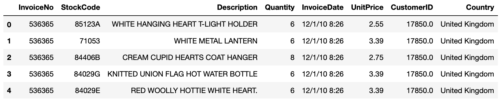
3. online_rt라는 변수에 데이터셋을 할당합니다.
>>> online_rt = pd.read_csv(path, encoding = 'latin1') # encoding 인수로 적합한 언어 인코딩을 적용합니다.
>>> online_rt.head()
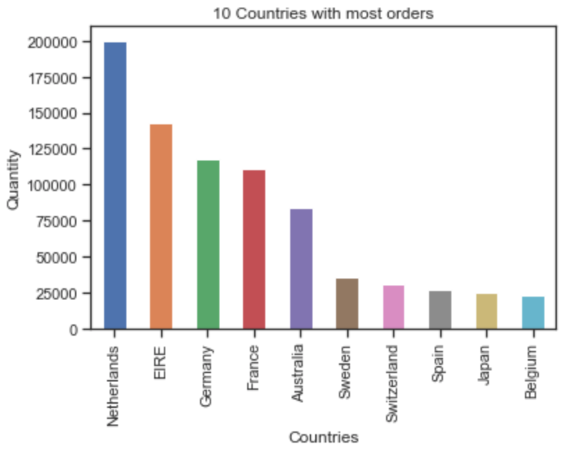
4. 영국을 제외하고 수량(Quantity)이 가장 많은 10개 국가에 대한 히스토그램을 만듭니다.
>>> countries = online_rt.groupby('Country').sum() # groupby 메서드를 사용해 국가별 합계를 구하고 countries 변수에 저장합니다.
>>> countries = countries.sort_values(by = 'Quantity', ascending=False) # sort_values 메서드로 정렬합니다. 이때 정렬 기준은 by인수를 사용해 'Quantity'로 정하고, ascending=False를 사용해 내림차순으로 정리합니다.
>>> countries['Quantity'].plot(kind='bar') # 그래프를 만듭니다.
>>> plt.xlabel('Countries') # x축 라벨을 정합니다.
>>> plt.ylabel('Quantity') # y축 라벨을 정합니다.
>>> plt.title('10 Countries with most orders') # 제목을 정합니다.
>>> plt.show() # 그래프를 보여줍니다.
5. 마이너스 수량은 제외하도록 처리합니다.
>>> online_rt = online_rt[online_rt.Quantity > 0] # 수량이 0보다 큰 경우에만 선택해서 online_rt 변수에 재배정합니다.
>>> online_rt.head()
6. 상위 3개 국가의 고객 ID별 단가별 수량을 사용하여 산점도를 만듭니다.
>>> customers = online_rt.groupby(['CustomerID', 'Country']).sum() # groupby 메서드를 사용해 CustomerID와 Country 컬럼에 대한 합계를 구해 customers 변수에 저장합니다.
>>> customers = customers[customers.UnitPrice > 0] # UnitPrice가 0보다 큰 데이타만 customers 변수에 재할당합니다.
>>> customers['Country'] = customers.index.get_level_values(1) # index.get_level_values() 메서드로 요청한 수준의 인덱스를 반환합니다. 레벨은 0부터 시작합니다.
>>> top_countries = ['Netherlands', 'EIRE', 'Germany']
>>> customers = customers[customers['Country'].isin(top_countries)] # top_countries에서 정한 국가들을 선택하기 위해 데이터 프레임을 필터링합니다.
>>> g = sns.FacetGrid(customers, col='Country') # FaceGrid를 만듭니다. FaceGrid가 만드는 플롯은 흔히 "격자", "격자"또는 "작은 다중 그래픽"이라고 불립니다.
>>> g.map(plt.scatter, 'Quantity', 'UnitPrice', alpha=1) # map 메서드로 각 Facet의 데이터 하위 집합에 플로팅 기능을 적용합니다.
>>> g.add_legend() # 범례를 추가합니다.
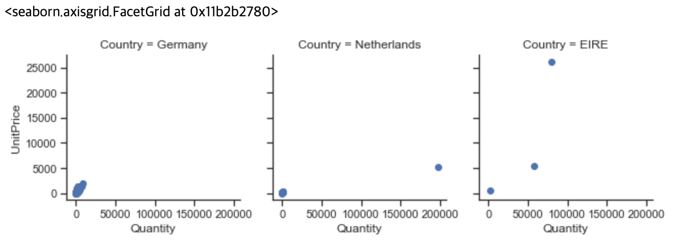
7. 앞의 결과가 왜 이렇게 보잘 것 없는지를 조사합니다.
>>> customers = online_rt.groupby(['CustomerID', 'Country']).sum()
>>> customers
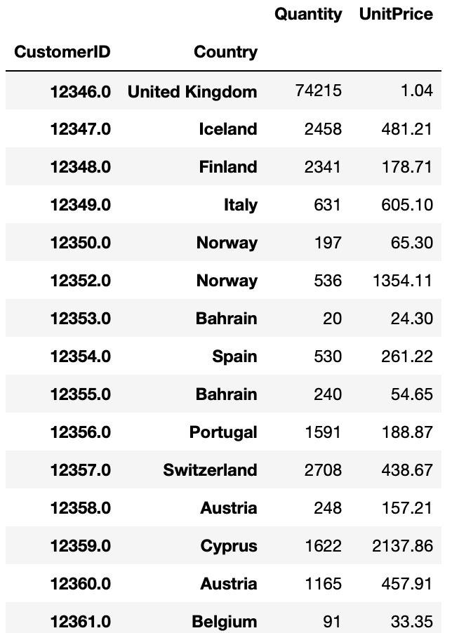
7-1. 수량(Quantity)과 단가(UnitPrice)를 별도로 보는 게 의미가 있을까?
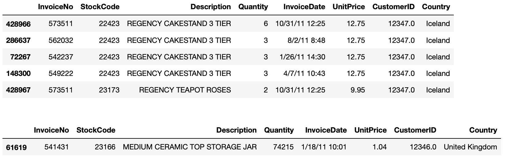
>>> display(online_rt[online_rt.CustomerID == 12347.0].sort_values(by='UnitPrice', ascending=False).head())
>>> display(online_rt[online_rt.CustomerID == 12346.0].sort_values(by='UnitPrice', ascending=False).head()) # 고객ID 12346.0번은 다른 나라와 다르게 수량이 매우 많고, 단가는 매우 낮게 나옵니다. 그 이유를 알아볼 필요가 있어서 살펴보고자 합니다. 아래 데이터에서 보듯이 고객 ID 12346.0은 단 한건의 주문으로 대량 주문한 경우가 되겠습니다.
7-2. 6번 최초의 질문으로 돌아가 보면, '상위 3개 국가의 고객 ID별 단가별 수량을 사용하여 산점도를 만듭니다'에 대해 구체화해서 생각해 봐야 합니다. 총 판매량이냐? 아니면 총 수익으로 계산해야 할 것인가? 먼저 판매량에 따라 분석해 보도록 하겠습니다.
>>> sales_volume = online_rt.groupby('Country').Quantity.sum().sort_values(ascending=False)
>>> top3 = sales_volume.index[1:4] # 영국을 제외합니다.
>>> top3

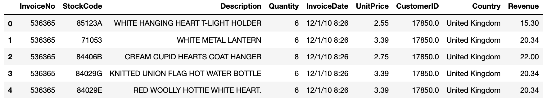
7-3. 이제 상위 3개국을 알게 되었습니다. 이제 나머지 문제에 집중합니다. 국가 ID는 쉽습니다. groupby 메서드로 'CustomerID'컬럼을 그룹핑하면 됩니다. 'Quantity per UnitPrice'부분이 까다롭습니다. 단순히 Quantity 또는 UnitPrice로 계산하는 것은 원하는 단가별 수량을 얻기 어렵습니다. 따라서, 두개 컬럼을 곱해 수익 'Revenue'라는 컬럼을 만듭니다.
>>> online_rt['Revenue'] = online_rt.Quantity * online_rt.UnitPrice
>>> online_rt.head()
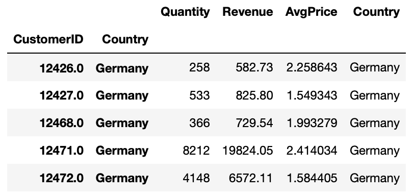
7-4. 각 국가 주문별로 평균 가격(수익/수량)을 구합니다.
>>> grouped = online_rt[online_rt.Country.isin(top3)].groupby(['CustomerID', 'Country])
>>> plottable = grouped['Quantity', 'Revenue'].agg('sum')
>>> plottable['Country'] = plottable.index.get_level_values(1)
>>> plottable.head()
7-5. 그래프 그리기.
>>> g = sns.FacetGrid(plottable, col='Country') # FaceGrid를 만듭니다. FaceGrid가 만드는 플롯은 흔히 "격자", "격자"또는 "작은 다중 그래픽"이라고 불립니다.
>>> g.map(plt.scatter, 'Quantity', 'AvgPrice', alpha=1) # map 메서드로 각 Facet의 데이터 하위 집합에 플로팅 기능을 적용합니다.
>>> g.add_legend() # 범례를 추가합니다.

7-6. 아직 그래프의 정보가 만족스럽지 못합니다. 많은 데이타가 수량은 50000 미만, 평균 가격은 5 이하인 경우라는 것을 확인할 수 있습니다. 트렌드를 볼 수 있을 것 같은데, 이 3개국 만으로는 부족합니다.
>>> grouped = online_rt.groupby(['CustomerID'])
>>> plottable = grouped['Quantity', 'Revenue'].agg('sum')
>>> plottable['AvgPrice'] = plottable.Revenue / plottable.Quantity
>>> plt.scatter(plottable.Quantity, plottable.AvgPrice)
>>> plt.plot()

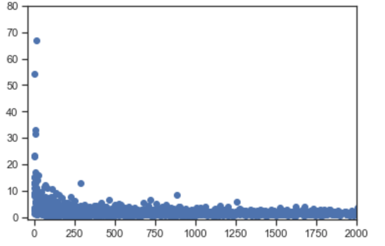
7-7. 커브를 명확하게 보기 위해 확대해 봅니다.
>>> grouped = online_rt.groupby(['CustomerID', 'Country'])
>>> plottable = grouped.agg({'Quantity' : 'sum', 'Revenue' : 'sum'})
>>> plottable['AvgPrice'] = plottable.Revenue / plottable.Quantity
>>> plt.scatter(plottable.Quantity, plottable.AvgPrice)
>>> plt.xlim(-40, 2000) # 확대하기 위해 x축을 2000까지만 표시합니다.
>>> plt.ylim(-1, 80) # y축은 80까지만 표시합니다.
>>> plt.plot() # 아래 그래프에서 우리는 인사이트를 볼 수 있습니다. 평균 가격이 높아질수록, 주문 수량은 줄어든다는 것입니다.
8. 단가 (x) 당 수익 (y)을 보여주는 선형 차트를 그립니다.
8-1. 가격 [0~50]을 간격 1로하여 단가를 그룹화하고 수량과 수익을 그룹핑니다.
>>> price_start = 0
>>> price_end = 50
>>> price_interval = 1
>>> buckets = np.arange(price_start, price_end, price_interval)
>>> revenue_per_price = online_rt.groupby(pd.cut(online_rt.UnitPrice, buckets)).Revenue.sum()
>>> revenue_per_price.head()
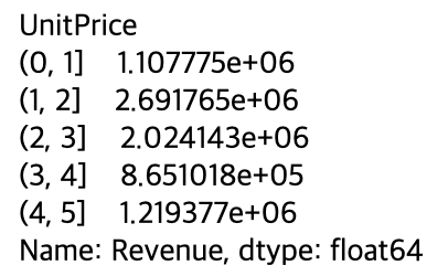
8-2. 그래프를 그려봅니다.
>>> revenue_per_price.plot()
>>> plt.xlabel('Unit Price (in intervals of ' +str(price_interval_+')')
>>> plt.ylabel('Revenue')
>>> plt.show()
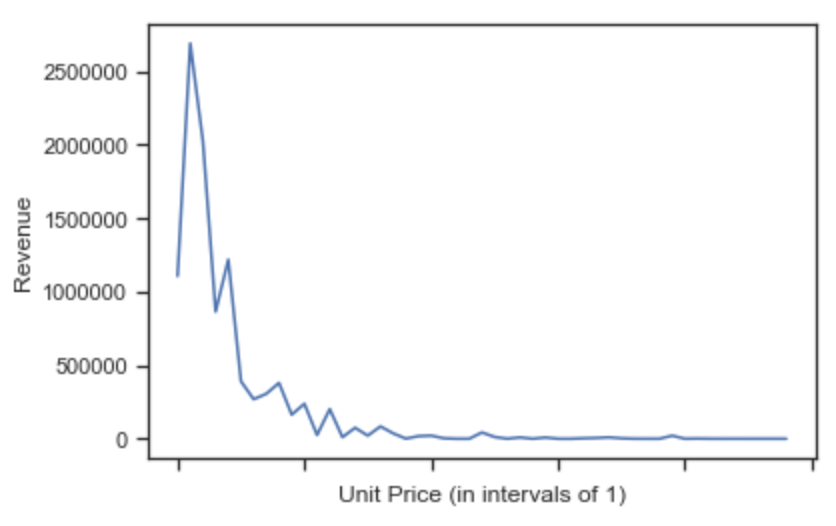
8-3. 좀 더 멋지게 그려보도록 합니다.
>>> revenue_per_price.plot()
>>> plt.xlabel('Unit Price (in buckets of '+str(price_interval)+')')
>>> plt.ylabel('Revenue')
>>> plt.xticks(np.arange(price_start, price_end, 3), np.arange(price_start, price_end, 3))
>>> plt.yticks(0, 500000, 1000000, 1500000, 2000000, 2500000], ['0', '$0.5M', '$1M', '$1.5M', '$2M', '$2.5M'])
>>> plt.show()
(Source : Pandas exercises 깃헙)
'파이썬으로 할 수 있는 일 > 파이썬 기초' 카테고리의 다른 글
| 데이터 삭제 (Pandas 레시피) (0) | 2019.05.18 |
|---|---|
| 시계열 처리- Time series (Pandas 레시피) (0) | 2019.05.17 |
| 데이터셋 기본 통계-Stats(Pandas 레시피) (0) | 2019.05.15 |
| 데이터셋 병합하기-merge(Pandas 레시피) (0) | 2019.05.14 |
| 커스텀 함수 적용하기-apply(Pandas 레시피) (0) | 2019.05.13 |